

Visual Identity
Branding – Monika Szucs’ Logos
Technical Information:
Software Programs used: Illustrator
Role: Illustrator and Brand Manager
Date: February 2017
Client: British Columbia Institute of Technology – Digital Design and Development Diploma – Dynamic Content Design
Introduction
The three logo’s I have created are for myself. I decided to create logos for myself for my Vector Graphics class in the Digital Design and Development Diploma. Since we had a task to create logo’s for anything we wanted. I decided to make logo’s for my future projects I want to create.
Before I was able to get into creating the logo I had to think of various icons or symbols inspirations to incorporate into my logo. This meant doing various sketches to see what I think would work or not.

Process
Branding
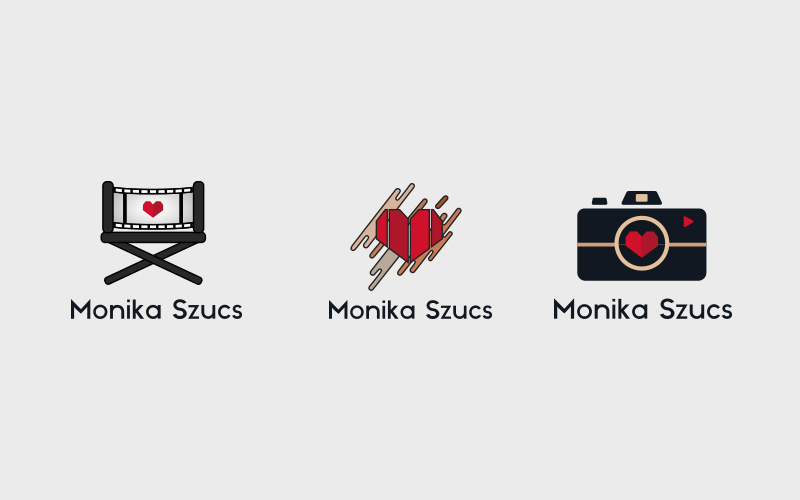
The reason I chose a heart is because I believe it represents me for who I am as a person. I am really passionate and love emotions. I believe a heart fits my personality because I am a caring person. I also love the idea of falling in love and being passionate in life.
Design
Short Films: I created a directors/producers chair because I feel it represents the entertainment industry and making short films and being creative. In order to incorporate my heart I put it at the center of the chair.
Do It Yourself (DIY): The logo with the heart broken up in 4 pieces with splatter behind it I feel represents creativity. The splatter reminds me of arts and crafts. The divides create an illusion like a folded paper. I love creating cards for different events. I also do various other arts and craft projects which is why I believe that logo fits me perfectly.
Vlogs: The logo with the camera represents filming yourself and documenting moments in your life. I love creating vlogs on my channel where I can capture and share moments with people.
Color
For the heart part of the logo I made sure they were always two shades of red. I really like how the slit between two shades of red gives more dimension and personality. The red, white, beige colors I chose are modern colors that represents my style. I believe they give a mature feel to the logos. I tried to use as minimal colors as possible so the heart stands out the most.
Solution
In the end I was able to complete all three logos. The logos are animated using Adobe After Effects and Premier Pro in my intros and outros for my YouTube channel. The logos are all important for branding purposes.
Throughout the changes and progress of my logo’s I am happy to say I finally found the ones that work and fit me and my style the best. However, it doesn’t mean I will stop upgrading my logo. I constantly strive towards creativity and changes.