Interface Designer
Information Architecture/User Interface | IFIT
Technical Information
Software Used:
Date:
Client:
IFIT | Website Development 4 COMP 4130 | Digital Design and Development Diploma | BCIT
Introduction
I created a Flow Chart, Task Diagram, Wireframes, and a Prototype. I wanted to take part in creating IFit because I felt it would be beneficial to help students at British Columbia Institute of Technology (BCIT) organize their schedule. This schedule will showcase what activities they have what day and what time so they never forget what is going on, on campus. We know that students have a busy life and we want to help them stay focused and organized and we can help them with our app so they never forget what is going on every day in their schedule.
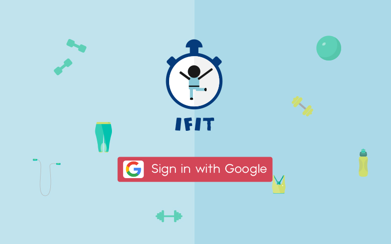
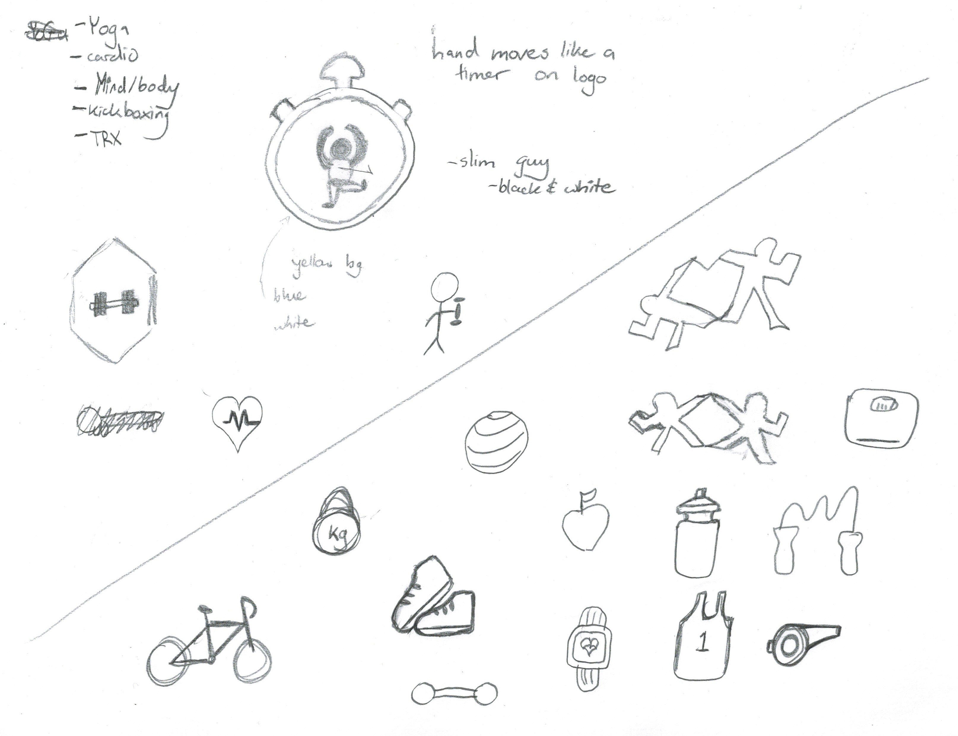
Throughout the process of making IFit, I have first, collaboratively worked with my team to write key words and images that could potentially work. I looked at various symbols or icons related to working out and the recreations available for BCIT students. The key topics included: Tai Chi, Study Stretch, Weekend Recovery Yoga, CTC, Ladies Who Life, and Mui Thai Kickboxing. From these topics we did extensive research into what the recreation is about and what makes it unique so we can properly create icons
Process
Sitemap/Flow
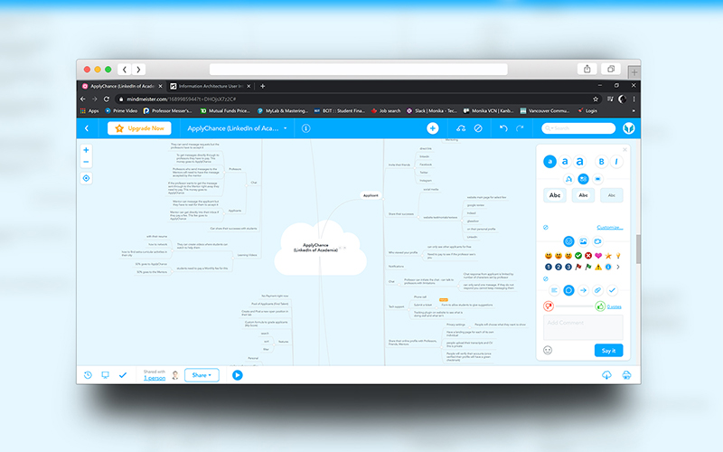
I created the sitemap to help users clearly see the different tabs and what will be within each of the pages users go to. This helped me think about the task diagram that would be needed. The task diagram I created was for the login/sign up page which clearly indicated the fields that needed to be filled out. Along the same lines, making sure the right credentials are filled in.
Wireframes
I created the wireframes in Photoshop to showcase where the various elements will be, before we begin coding out the Web App. We created this document to clearly showcase who created it, what page you are looking at, what version, if there are any changes or unresolved issues, any related documents, and general notes. This helped organize all the information of each page saved in a pdf document.
Prototypes
Lastly, the prototypes (Medium Fidelity) shows exactly what the product will look like for the desktop, tablet and mobile versions. This will all help before we get into programming and the branding style. The prototype was created in Illustrator. This gave me more control on creating the assets right away and getting the layout of the pages done.
Solution
In the end, through careful planning I was able to help my team members plan out how everything will function and look before we started coding the website application. Planning everything ahead of time is important because it helps the team know exactly why each part is placed or designed a certain way. Its not just about making things look good but making sure everything is functional and has a purpose.


