Application Designer
Information Architecture and User Interface Designer – Sandwich.io
Technical Information:
Programs used: Balsamiq, Illustrator, Photoshop, Microsoft Word
Role: Information Architect and User Interface Designer
Date: January 2017
Client: British Columbia Institute of Technology – Design 1
Introduction
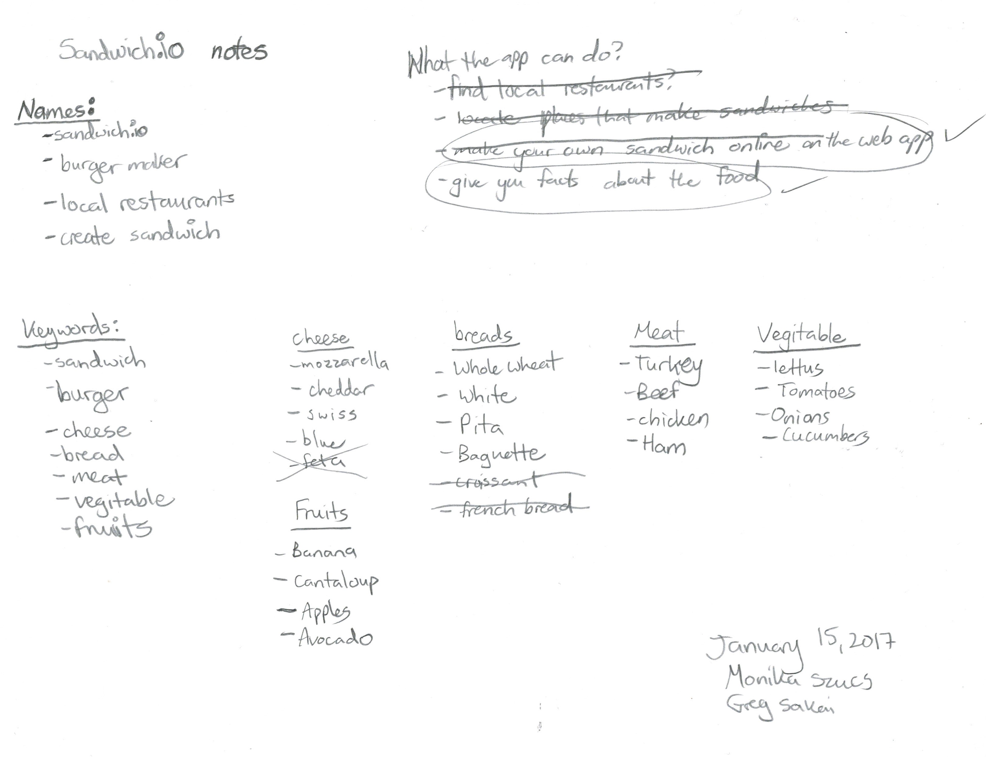
I created Wireframes, Sitemaps, Flows, a Style Guide and a Prototype for Sandwich.io. Throughout the process of doing Sandwich.io I wrote out various Search Engine Optimization words that could help my partners and I think of ideas of how we should go about creating something food related. At first, we weren’t sure what we should do so we wrote down key words. The names included sandwich.io, burger maker, local restaurants, and create sandwich. The key words for the main topics included, sandwich, burger, cheese, bread, meat, vegetable, and fruits. Then, from those topics, we broke it down to even narrower words such as:
Cheese: mozzarella, cheddar, Swiss, blue cheese
Meat: Turkey, beef, chicken, ham
Fruits: Banana, Cantaloupe, Apples, Avocado
Breads: Whole wheat, White, Pita, Baguette
Vegetable: Lettus, Tomato, Onions, Cucumber.
Logo and Icon Creation
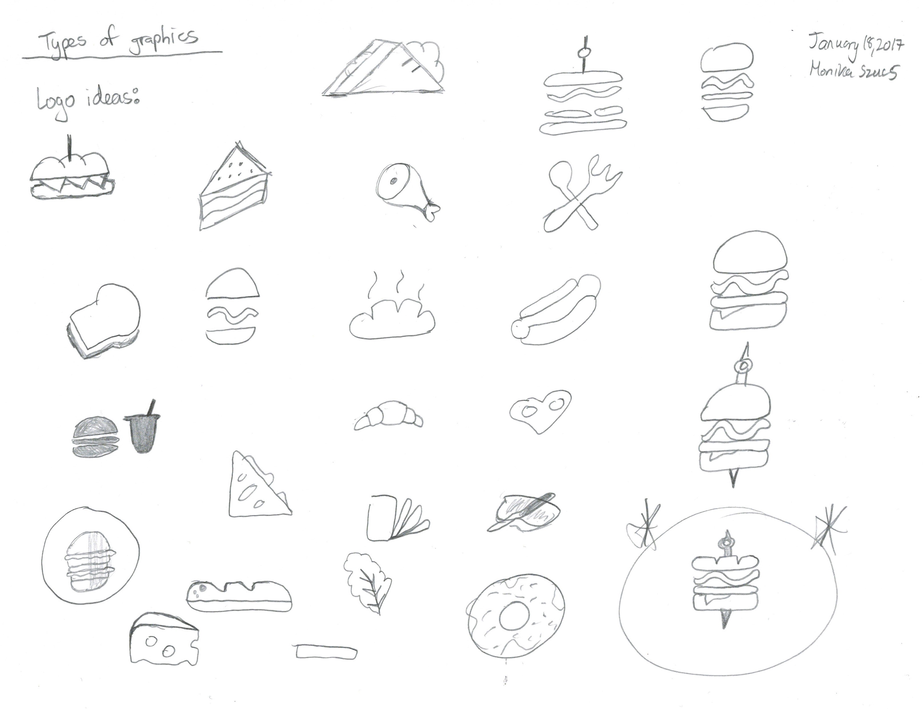
While thinking of key words I also draw out various icons that could be use throughout the Web Application. After drawing out various possibilities I finally found the right icon after trying various combinations.
Process
Site Maps/Flows
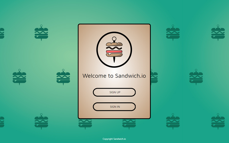
I created the sitemap to help users clearly see the different tabs and what will be within each of the pages users go to. This helped me think about the task diagram that would be needed. The task diagram I created was for the login/sign up page which clearly indicated the fields that needed to be filled out. Along the same lines, making sure the right credentials are filled in. Third, the wireframes created are all important for determining where text and images will be located. I made sure to clearly indicate what sections were images, and texts while keeping track of important information. Lastly, the prototype showed exactly what the product will look like for the desktop, tablet and mobile versions.
Style Guide
I created a Style Guide/Brand Guideline in the Digital Design and Development program in my Design 1 course. I used Illustrator and did various research online to get the right color palette for my group’s Web App. I made sure that the report was in the proper format by doing various research and grabbed examples online to follow the proper template.
The Style Guide is to help my team stick to the same branding (background and brand values), Logo (does, dont’s, spacing, sizes, positioning), Color (RGB Pallette, BW Palette, Primary Palette for background/buttons, Primary palette for foods), Buttons/Arrows/Icons (Buttons and Arrows images, bounding box, navibar, menu icons/buttons, build page layout), Typography (header, footer), Menu, Images (background images and product images).
Wireframes
I created the wireframes in Photoshop to showcase where the various elements will be, before we begin coding out the Web App. We created this document to clearly showcase who created it, what page you are looking at, what version, if there are any changes or unresolved issues, any related documents, and general notes. This helped organize all the information of each page saved in a pdf document.
However while careful planning with my team member we realized we had to change the layout and design of some pages. We needed to make sure the clutter on each page was reduced to create an easy user experience. The Web App needed a simple, clean and modern look. This is why we created version 02 to showcase any updates we have done. Throughout this time we also throughout about how each section could be edited together. This is why we simplified a lot of the pages as well.
Solution
In the end when we finished creating the Wireframes, Prototypes, and coding out the website we did a Usability Test Report. This report consisted of a serious of questions for students who tested our Web App to fill out. We had 4 people test out our Web App and give us feedback about what needed changing, any improvements, or deleting elements. We made sure we told people who were testing our app at the beginning what the purpose of the study was. Then, we told them about the objectives, tasks and then a questionnaire at the end.
For each page that users tested, they ranked the pages and told us which areas needed improvement. This helped us if we needed to redesign anything before we went back into coding the Web App.


